Search
Documentation
Column.
Learn how to use the column block.
Read the original Bootstrap documentation on columns here.
Overview
When building grid layouts, all content goes in columns. Columns can be added to a page to build up complex layouts. The column block has some useful options to help with displaying columns exactly how you want them at different breakpoints. The column block has the following options:
Settings
URL
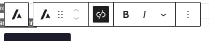
In the block toolbar you will see a link icon. When you click this icon you will see an option to add a url. The url can be to a webpage or an id attribute on the page. To add a link simply type it into the link field. There is also an additional option to open the link in a new tab. If this option is checked then a target="_blank" attribute will be added to the link.
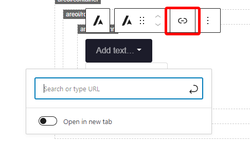
Once you add a link you may decide you want to remove it. When a block has a link the link icon will have a black background, to remove the link click the icon.
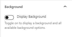
Background
Display background
The block allows you to set a background. If you wish to display a background on the block you need to check this option. By checking this option a number of other background options will be displayed. To remove a background completely, uncheck this option. By default this option is unchecked.
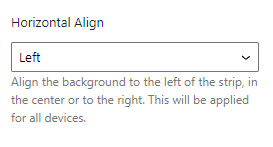
Horizontal align
You can specify the number of columns you wish a background to span. The Horizontal Align option allows you to align the background horizontally (left to right). You can align a background to the left, centre or the right.
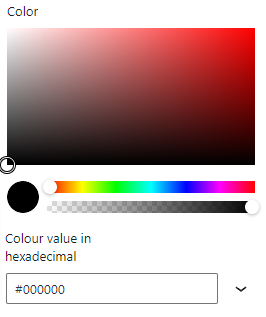
Color
The color option allows you to specify a background colour. The background colour can be any colour you wish. You can select the colour using the colour picker or input a colour in the available field underneath the colour picker.
Image
The image option allows you to add an image as the background. Any image that is added will automatically be scaled to fill the available space of the background. To select a background click Choose image. This will bring up the default WP media panel where you can upload or select an image to use.
Video
The video option allows you to add a video as the background. Any video that is added will automatically be scaled to fill the available space of the background. To select a background click Choose video. This will bring up the default WP media panel where you can upload or select a video to use.
Display overlay
You may wish to apply an overlay over the top of your background. This is useful if you want to add text over the top and make sure it’s easily readable. In order to display an overlay the display overlay option must be checked. When checked an additional option will appear. You can remove an overlay by unchecking this option.
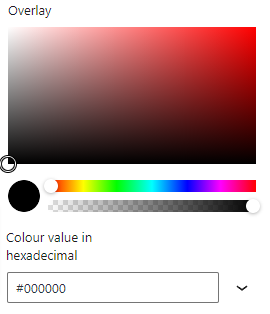
Overlay
The overlay option allows you to select a colour for your overlay. You can also set the transparency of the overlay.
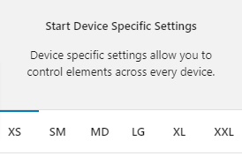
Device specific settings
Along with global options for a block there are also device specific settings. These settings allow you to specify options that will be applied to their relevant device size. The device sizes available match up with the Bootstrap breakpoints:
- XS (<576px)
- SM (≥576px)
- MD (≥768px)
- LG (≥992px)
- XL (≥1200px)
- XXL (≥1400px).
Device specific settings are tabbed and to update a specific device you simply need to click on the relevant tab to reveal the options. Each device has the same options available. For the purpose of these docs we only explain one device tab (as all of the other tabs are the same for their related breakpoint).
Highlighted Tabs
Due to there being options for a number of different device sizes it could become confusing remembering which settings you have chosen. To help, when you make a change in a specific device tab the tab will be highlighted green. If all of the values in the tab are reverted back to the default then the highlight will disappear.
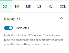
Display (XS)
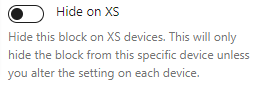
Hide on XS
You can hide this block on any device. As default all blocks are displayed. If you wish to hide a block on a specific device you can check this option. This option will only apply to the related device. To hide on other devices, click on the relevant device tab and check the Hide on [device] option.
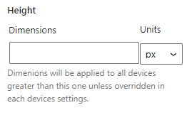
Height
The height option allows you to specify a height for the chosen block. The height setting will be applied to the current device and all larger devices. If you wish to have different heights on different devices you will need to click on the relevant tab and set the option. The dimensions field should be a number, the units field has a number of options: px, %, vh and rem. The value that is applied to the block is the dimension with the unit appended to it eg: 100px or 100% or 100vh.
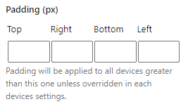
Padding
The padding option allows you to specify what padding should be applied to the block. This will apply to the current breakpoint and all larger breakpoint so if you wish to have different padding on other devices you will need to set this option for each breakpoint. You can specify top, right, bottom and left. You should only insert a number into these fields.
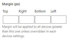
Margin
The margin option allows you to specify what margin should be applied to the block. This will apply to the current breakpoint and all larger breakpoint so if you wish to have different margin on other devices you will need to set this option for each breakpoint. You can specify top, right, bottom and left. You should only insert a number into these fields.
Settings (XS)
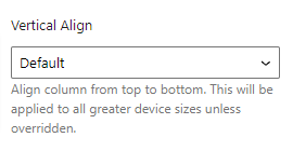
Vertical align
The vertical align options allows you to position the selected column within a row vertically (top to bottom). The vertical align option will be applied to the current breakpoint and any larger ones. This can be overridden on each breakpoint. There are three options available for vertical alignment:
- Start: Align selected column to top of row
- Center: Aligns selected column to centre of row
- End: Aligns selected column to bottom of row
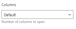
Columns
The columns option allows you to specify how many columns the current block should span. The columns option will be applied to the current breakpoint and any larger ones. This can be overridden on each breakpoint. Each column block can span between 1 and 12 columns.
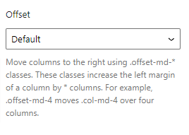
Offset
The offset column allows you to push a column block over to the right by the specified number of columns. The offset option will be applied to the current breakpoint and any larger ones. This can be overridden on each breakpoint. Each column block can be offset between 1 and 12 columns.
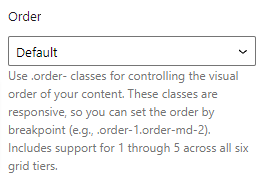
Order
The order option allows you to specify what order to display the current column. Any columns set to default will show first, then columns will be ordered in ascending order based on this value. The order option will be applied to the current breakpoint and any larger ones. This can be overridden on each breakpoint. Each column block can be ordered between 1 and 6.
Background (XS)
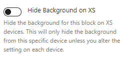
Hide background on XS
The hide background on [device] allows you to hide the background at the related breakpoint. This will only apply to the current breakpoint. To hide at other breakpoints this option will need to be checked on each breakpoint.
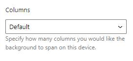
Columns
The columns options allows you to specify how many columns the background should span. This gives you the ability to set different widths for the background at different breakpoints. For example you could have a background go 100% width on mobile but only 50% on desktop.
Reset Settings
Blocks tend to have a large number of settings along with different settings for each device size. You may get to the point where you have changed lots of settings and want to revert them back to the default. This can be time consuming and difficult to remember which settings have been changed to we have supplied three buttons that make this a piece of cake. Simply click the relevant button to reset your settings.
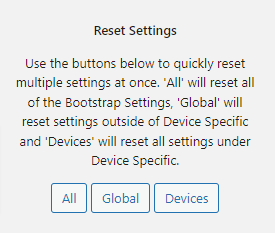
- All: When you click this button is will reset all of the settings for the selected block
- Global: When you click this button it will reset all of the settings outside of the device specific tabs
- Devices: When you click this button it will reset all of the settings within the Device Specific tabs
Advanced
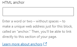
HTML Anchor
The HTML anchor option allows you to set an ID on the current block. This is useful when you wish to link to a specific area on a page.
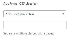
Additional CSS class(es)
The additional class(es) option lets you add any other classes to the block. This is really useful as it allows you to utilise all of the Bootstrap utility classes to quickly apply styles and add more advanced customisations. A few examples of this would be to align all inner content by adding the text-start, text-center or text-end classes. You also have the ability to quickly search all of the available Bootstrap classes. To search Bootstrap classes open the Add Bootstrap class select box. You can filter the results by typing in the available search field. When you select an option it will automatically be added to your class list.