Search
Documentation
Column Break.
Learn how to use the column break block.


Read the original Bootstrap documentation on columns and breaks here.
Overview
Breaking columns to a new line in flexbox requires a small hack. The column break block adds an element with width: 100% to wrap your columns to a new line. Normally this is accomplished with multiple .rows, but not every implementation method can account for this. The column break has the following options:
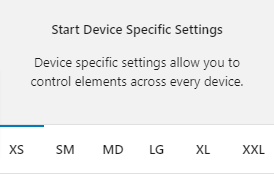
Device specific settings
Along with global options for a block there are also device specific settings. These settings allow you to specify options that will be applied to their relevant device size. The device sizes available match up with the Bootstrap breakpoints:
- XS (<576px)
- SM (≥576px)
- MD (≥768px)
- LG (≥992px)
- XL (≥1200px)
- XXL (≥1400px).
Device specific settings are tabbed and to update a specific device you simply need to click on the relevant tab to reveal the options. Each device has the same options available. For the purpose of these docs we only explain one device tab (as all of the other tabs are the same for their related breakpoint).
Highlighted Tabs
Due to there being options for a number of different device sizes it could become confusing remembering which settings you have chosen. To help, when you make a change in a specific device tab the tab will be highlighted green. If all of the values in the tab are reverted back to the default then the highlight will disappear.
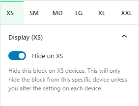
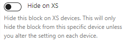
Hide on XS
You can hide this block on any device. As default all blocks are displayed. If you wish to hide a block on a specific device you can check this option. This option will only apply to the related device. To hide on other devices, click on the relevant device tab and check the Hide on [device] option.