Search
Documentation
Navs & tabs.
Learn how to use the navs & tabs block.


Read the original Bootstrap documentation on navs & tabs here.
Overview
The navs & tabs block allows you to add styled navigations to your page. When you add the navs & tabs block to the page you gain access to the nav item block. Navs & tabs can include as many items as you wish.
The navs & tabs block has the following options:
Settings
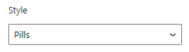
Style
The style option allows you to change the look and feel of the nav. There are three options available:
- Default: Will displayed an unstyled list of items horizontally
- Tabs: Takes the basic nav from above and adds the
.nav-tabsclass to generate a tabbed interface. - Pills: Take that same HTML, but use
.nav-pillsinstead
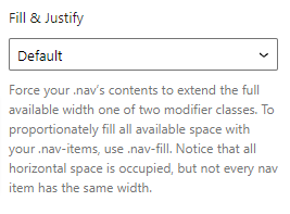
Fill & justify
The fill & justify option allows you to control how your nav items are spaced across the page. There are three options available:
- Default: Displays each item at it’s default width
- Fill: Proportionately fills all available space with your
.nav-items - Justify: All horizontal space will be occupied by nav links, but unlike the
.nav-fillabove, every nav item will be the same width
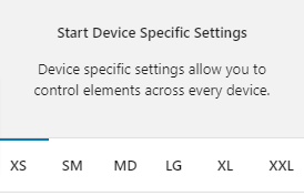
Device specific settings
Along with global options for a block there are also device specific settings. These settings allow you to specify options that will be applied to their relevant device size. The device sizes available match up with the Bootstrap breakpoints:
- XS (<576px)
- SM (≥576px)
- MD (≥768px)
- LG (≥992px)
- XL (≥1200px)
- XXL (≥1400px).
Device specific settings are tabbed and to update a specific device you simply need to click on the relevant tab to reveal the options. Each device has the same options available. For the purpose of these docs we only explain one device tab (as all of the other tabs are the same for their related breakpoint).
Highlighted Tabs
Due to there being options for a number of different device sizes it could become confusing remembering which settings you have chosen. To help, when you make a change in a specific device tab the tab will be highlighted green. If all of the values in the tab are reverted back to the default then the highlight will disappear.
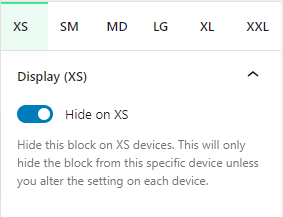
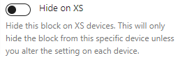
Hide on XS
You can hide this block on any device. As default all blocks are displayed. If you wish to hide a block on a specific device you can check this option. This option will only apply to the related device. To hide on other devices, click on the relevant device tab and check the Hide on [device] option.
Settings (XS)
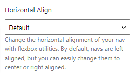
Horizontal align
The horizontal align option allows you to change the horizontal alignment of your nav with flexbox utilities. By default, navs are left-aligned, but you can easily change them to centre or right aligned. There are six options available:
- Start: Aligns nav to the left of the row
- Center: Aligns nav to the middle of the row
- End: Aligns nav to the right of the row
- Around: Aligns nav with space before, between and after them
- Between: Aligns nav with space between them
- Evenly: Aligns nav with equal space around them
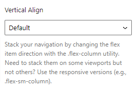
Vertical align
The vertical align option allows you to stack your navigation by changing the flex item direction with the .flex-column utility. There are two options available:
- Default: Displays the items in a single line horizontally
- Vertical: Stacks the items on top of each other vertically
Reset Settings
Blocks tend to have a large number of settings along with different settings for each device size. You may get to the point where you have changed lots of settings and want to revert them back to the default. This can be time consuming and difficult to remember which settings have been changed to we have supplied three buttons that make this a piece of cake. Simply click the relevant button to reset your settings.
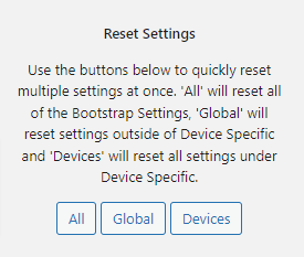
- All: When you click this button is will reset all of the settings for the selected block
- Global: When you click this button it will reset all of the settings outside of the device specific tabs
- Devices: When you click this button it will reset all of the settings within the Device Specific tabs
Advanced
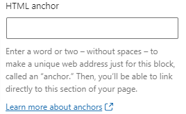
HTML Anchor
The HTML anchor option allows you to set an ID on the current block. This is useful when you wish to link to a specific area on a page.
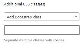
Additional CSS class(es)
The additional class(es) option lets you add any other classes to the block. This is really useful as it allows you to utilise all of the Bootstrap utility classes to quickly apply styles and add more advanced customisations. A few examples of this would be to align all inner content by adding the text-start, text-center or text-end classes. You also have the ability to quickly search all of the available Bootstrap classes. To search Bootstrap classes open the Add Bootstrap class select box. You can filter the results by typing in the available search field. When you select an option it will automatically be added to your class list.
Nav item
Settings
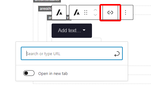
URL
In the block toolbar you will see a link icon. When you click this icon you will see an option to add a url. The url can be to a webpage or an id attribute on the page. To add a link simply type it into the link field. There is also an additional option to open the link in a new tab. If this option is checked then a target="_blank" attribute will be added to the link.
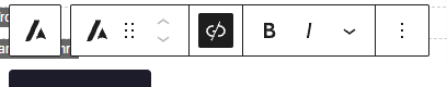
Once you add a link you may decide you want to remove it. When a block has a link the link icon will have a black background, to remove the link click the icon.
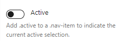
Active
The active option allows you to add .active to a .nav-item to indicate the current active selection. By default this is unchecked.
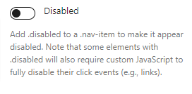
Disabled
The disabled option allows you to add .disabled to a .nav-item to make it appear disabled. Note that some elements with .disabled will also require custom JavaScript to fully disable their click events (e.g., links). By default this option is unchecked.
Device specific settings
Along with global options for a block there are also device specific settings. These settings allow you to specify options that will be applied to their relevant device size. The device sizes available match up with the Bootstrap breakpoints:
- XS (<576px)
- SM (≥576px)
- MD (≥768px)
- LG (≥992px)
- XL (≥1200px)
- XXL (≥1400px).
Device specific settings are tabbed and to update a specific device you simply need to click on the relevant tab to reveal the options. Each device has the same options available. For the purpose of these docs we only explain one device tab (as all of the other tabs are the same for their related breakpoint).
Highlighted Tabs
Due to there being options for a number of different device sizes it could become confusing remembering which settings you have chosen. To help, when you make a change in a specific device tab the tab will be highlighted green. If all of the values in the tab are reverted back to the default then the highlight will disappear.
Hide on XS
You can hide this block on any device. As default all blocks are displayed. If you wish to hide a block on a specific device you can check this option. This option will only apply to the related device. To hide on other devices, click on the relevant device tab and check the Hide on [device] option.
Reset Settings
Blocks tend to have a large number of settings along with different settings for each device size. You may get to the point where you have changed lots of settings and want to revert them back to the default. This can be time consuming and difficult to remember which settings have been changed to we have supplied three buttons that make this a piece of cake. Simply click the relevant button to reset your settings.
- All: When you click this button is will reset all of the settings for the selected block
- Global: When you click this button it will reset all of the settings outside of the device specific tabs
- Devices: When you click this button it will reset all of the settings within the Device Specific tabs
Advanced
HTML Anchor
The HTML anchor option allows you to set an ID on the current block. This is useful when you wish to link to a specific area on a page.
Additional CSS class(es)
The additional class(es) option lets you add any other classes to the block. This is really useful as it allows you to utilise all of the Bootstrap utility classes to quickly apply styles and add more advanced customisations. A few examples of this would be to align all inner content by adding the text-start, text-center or text-end classes. You also have the ability to quickly search all of the available Bootstrap classes. To search Bootstrap classes open the Add Bootstrap class select box. You can filter the results by typing in the available search field. When you select an option it will automatically be added to your class list.