Search
Documentation
Button.
Learn how to use the button block.


Read the original Bootstrap documentation on buttons here.
Overview
The button block enables you to use the built in Bootstrap button helpers to create custom button styles. You can quickly change the background colour and size of buttons and use them to link to new pages and open modals and collapsible content. The button block also has the ability to include dropdowns, popovers, tooltips and badges. When dropdowns are enabled on a button you have the ability to add the dropdown item block. The docs for the dropdown item block can be found towards the bottom of the page.
Example Button 1- Button settings
- Badge settings
- Popover settings
- Tooltip settings
- Dropdown settings
- Dropdown item settings
The button block has the following options:
Settings
URL
In the block toolbar you will see a link icon. When you click this icon you will see an option to add a url. The url can be to a webpage or an id attribute on the page. To add a link simply type it into the link field. There is also an additional option to open the link in a new tab. If this option is checked then a target="_blank" attribute will be added to the link.
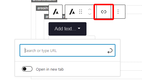
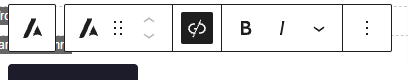
Once you add a link you may decide you want to remove it. When a block has a link the link icon will have a black background, to remove the link click the icon.
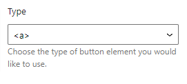
Type
The type option allows you tos specify what type of element should be used for the button. There are two options:
- <a>: Will add the button as a hyperlink
- <button>: Will add the button as a button element
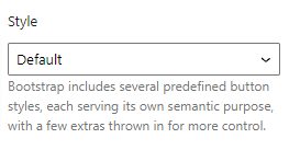
Style
The style option allows you to choose the style of the button from the predefined theme styles built in to WordPress. When selected yo will see the appearence of the button change to match the background, border and text colour of the chosen option. The options available are:
- Primary
- Primary (Outline)
- Secondary
- Secondary (Outline)
- Success
- Success (Outline)
- Danger
- Danger (Outline)
- Warning
- Warning (Outline)
- Info
- Info (Outline)
- Light
- Light (Outline)
- Dark
- Dark (Outline)
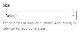
Size
The size options allows you to select the size of the button from predefined Bootstrap sizes. When you select a size option an additional size class will be added to the button block. The options available are:
- Small: Add
.btn-smclass to block - Medium: This is the default style so won’t add any additional class
- Large: Add
.btn-lgclass to block
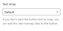
Text wrap
The text wrap option allows you to force text within the button to wrap or not wrap onto a new line. There are two options:
- Wrap: This is the default option so no class will be added
- No Wrap: This will add the
.text-nowrapclass to the block
Additional
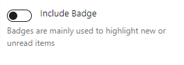
Include badge
The include badge option allows you to add or remove a badge on the button. A badge is a small count or labelling component. When this option is checked an additional settings section labelled Badge will appear.
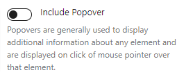
Include popover
The include popover option allows you to add a popover to the block. A popover is a popup that includes a header and body content that will display when a user does a certain action such as hovers over the button. When this option is checked an additional settings section labelled Popover will appear.
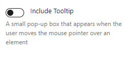
Include tooltip
The include tooltip option allows you to add a tooltip to the block. A tooltip is a popup that includes simple content that will display when a user hovers over the button. When this option is checked an additional settings section labelled Tooltip will appear.
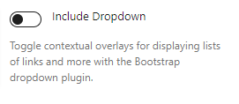
Include dropdown
The include dropdown option allows you to turn the button into a dropdown. A dropdown allows you to display a list of links and other content when a user clicks the button. When this option is checked and additional settings section labelled Dropdown will appear. This will also update the editor view to include a dropdown where you can add items to your dropdown.
When you include a dropdown, the dropdown item block becomes available. The docs for that block can be found at the bottom of this page.
Badge
Read the original Bootstrap documentation on badges here.
A badge is a small count or labelling component.
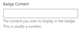
With Badge 1Badge content
The badge content option allows you to specify what should be shown within the badge. This can be any text you wish. Remember there is limited space within the badge so best to keep this short.
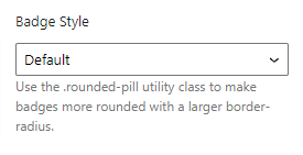
Badge style
The badge style option allows you to specify whether the badge should be squared or rounded. There are two options:
- Default: Will display a squared badge
- Rounded: Will display the badge as a circle
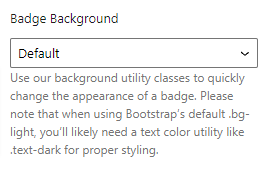
Badge background
The badge background option allows you to specify the background colour of the badge by choosing from a list of theme colours. The options available are:
- Primary
- Secondary
- Success
- Danger
- Warning
- Info
- Light
- Dark
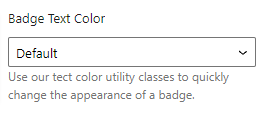
Badge text color
The badge text color option allows you to specify the text colour of the badge by choosing from a list of theme colours. The options available are:
- Primary
- Secondary
- Success
- Danger
- Warning
- Info
- Light
- Dark
Additional badge classes
There is an additional badge class option in case you wish to add any other classes to your badge. This is useful if you want to add an identifier to the badge or make use of the built in Bootstrap utility classes.
Popover
Read the original Bootstrap documentation on popovers here.
A popover is a pop up box that will appear when a user does a certain action such as hovering over the button or clicking it. A popover includes a header which allows a single line of text and a body that allows multiple lines of text.
With PopoverPopover title
The popover option allows you to add a single line of text that will display in the popover header section.
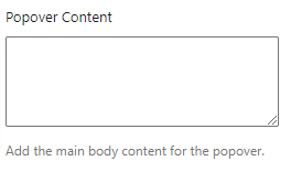
Popover content
The popover content option allows you to add multiple lines of text that will display in the body of the popover.
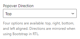
Popover direction
The popover direction option allows you to specify where the popover should be placed when open. There are four placement options to choose from:
- Top: Displays the popover above the button
- Right: Displays the popover to the right of the button
- Bottom: Displays the popover underneath the button
- Left: Displays the popover to the left of the button
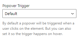
Popover trigger
The popover trigger options allows you to specify what action should trigger the popup to show. There are two options available:
- Default: The popover will display when a user clicks the button.
- Hover: The popover will display when a user hovers over the button.
Tooltip
Read the original Bootstrap documentation on tooltips here.
A tooltip is a popup that appears when a user hovers over the button. The popup will display a simple, short line of text.
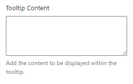
With TooltipTooltip content
The tooltip content option allows you to add multiple lines of text that will appear within the tooltip pop up.
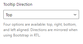
Tooltip direction
The tooltip direction option allows you to specify where the tooltip should be placed when open. There are four placement options to choose from:
- Top: Displays the tooltip above the button
- Right: Displays the tooltip to the right of the button
- Bottom: Displays the tooltip underneath the button
- Left: Displays the tooltip to the left of the button
Dropdown
Read the original Bootstrap documentation on dropdowns here.
A dropdown allows you to display a list of links and other content when a user clicks the button. When a dropdown is added you will also gain access to the dropdown item block.
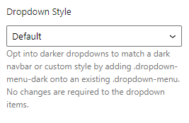
Dropdown style
The dropdown style option allows you to select which colour scheme to use for the dropdown. There are 2 options to choose from:
- Default: This will display a light coloured dropdown.
- Dark: This will display a dark coloured dropdown. This applies the
.dropdown-menu-darkclass to the dropdown.
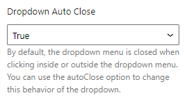
Dropdown auto close
The dropdown auto close option allows you to control how the dropdown should behave in regards to closing based on actions the user takes. There are four options available:
- True: Will close when a user clicks anywhere on the screen
- Inside: Will close when a user selects an item within the dropdown
- Outside: Will close when a user clicks anything outside of the dropdown, but stays open when a dropdown item is clicked
- False: Will close only when the button is clicked again
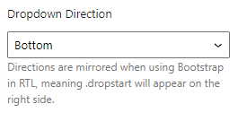
Dropdown direction
The dropdown direction option allows you to specify where the dropdown should be placed when open. There are four placement options to choose from:
- Top: Displays the above the button
- Right: Displays the to the right of the button
- Bottom: Displays the underneath the button
- Left: Displays the to the left of the button
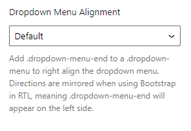
Dropdown menu alignment
The dropdown menu alignment option allows you to specify how the inner dropdown items should be aligned. There are two options to choose from:
- Default: will align dropdown items to the left of the dropdown
- Right: Adds the
.dropdown-menu-endclass to align the dropdown items to the right of the dropdown.
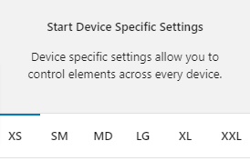
Device specific settings
Along with global options for a block there are also device specific settings. These settings allow you to specify options that will be applied to their relevant device size. The device sizes available match up with the Bootstrap breakpoints:
- XS (<576px)
- SM (≥576px)
- MD (≥768px)
- LG (≥992px)
- XL (≥1200px)
- XXL (≥1400px).
Device specific settings are tabbed and to update a specific device you simply need to click on the relevant tab to reveal the options. Each device has the same options available. For the purpose of these docs we only explain one device tab (as all of the other tabs are the same for their related breakpoint).
Highlighted Tabs
Due to there being options for a number of different device sizes it could become confusing remembering which settings you have chosen. To help, when you make a change in a specific device tab the tab will be highlighted green. If all of the values in the tab are reverted back to the default then the highlight will disappear.
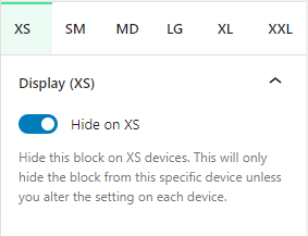
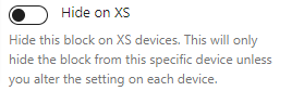
Hide on XS
You can hide this block on any device. As default all blocks are displayed. If you wish to hide a block on a specific device you can check this option. This option will only apply to the related device. To hide on other devices, click on the relevant device tab and check the Hide on [device] option.
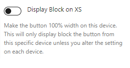
Display block on XS
You can force a button to display at 100% on any device. As default all blocks are displayed inline. If you wish to display a button as a block on a specific device you can check this option. This option will only apply to the related device. To display block on other devices, click on the relevant device tab and check the Display Block on [device] option.
Reset Settings
Blocks tend to have a large number of settings along with different settings for each device size. You may get to the point where you have changed lots of settings and want to revert them back to the default. This can be time consuming and difficult to remember which settings have been changed to we have supplied three buttons that make this a piece of cake. Simply click the relevant button to reset your settings.
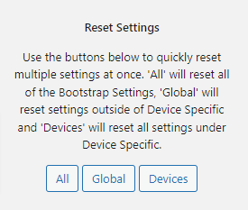
- All: When you click this button is will reset all of the settings for the selected block
- Global: When you click this button it will reset all of the settings outside of the device specific tabs
- Devices: When you click this button it will reset all of the settings within the Device Specific tabs
Advanced
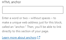
HTML Anchor
The HTML anchor option allows you to set an ID on the current block. This is useful when you wish to link to a specific area on a page.
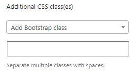
Additional CSS class(es)
The additional class(es) option lets you add any other classes to the block. This is really useful as it allows you to utilise all of the Bootstrap utility classes to quickly apply styles and add more advanced customisations. A few examples of this would be to align all inner content by adding the text-start, text-center or text-end classes. You also have the ability to quickly search all of the available Bootstrap classes. To search Bootstrap classes open the Add Bootstrap class select box. You can filter the results by typing in the available search field. When you select an option it will automatically be added to your class list.
Dropdown item
Settings
URL
In the block toolbar you will see a link icon. When you click this icon you will see an option to add a url. The url can be to a webpage or an id attribute on the page. To add a link simply type it into the link field. There is also an additional option to open the link in a new tab. If this option is checked then a target="_blank" attribute will be added to the link.
Once you add a link you may decide you want to remove it. When a block has a link the link icon will have a black background, to remove the link click the icon.
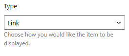
Type
The type option allows you to specify how the dropdown item should be displayed. Different options apply different styles and actions. There are four options available:
- Link: Will add the item as a hyperlink
- Header: Will add the item as a header. Dropdown item headers are styled different to other items and can be used to group links.
- Divider: Will add a line divider
- Text: Will add the item as plain text with no hyperlink
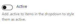
Active
The active option allows you to add the .active class to a dropdown item. When this class is added the item will be styled differently to show that it is the active item based on your Bootstrap settings.
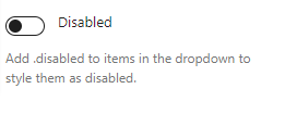
Disabled
The disabled option allows you to add the .disabled class to a dropdown item. When this class is added the item will be styled differently to show users that the item isn’t clickable. Additional JS may be needed to prevent users clicking a disabled item.
Reset Settings
Blocks tend to have a large number of settings along with different settings for each device size. You may get to the point where you have changed lots of settings and want to revert them back to the default. This can be time consuming and difficult to remember which settings have been changed to we have supplied three buttons that make this a piece of cake. Simply click the relevant button to reset your settings.
- All: When you click this button is will reset all of the settings for the selected block
- Global: When you click this button it will reset all of the settings outside of the device specific tabs
- Devices: When you click this button it will reset all of the settings within the Device Specific tabs
Advanced
HTML Anchor
The HTML anchor option allows you to set an ID on the current block. This is useful when you wish to link to a specific area on a page.
Additional CSS class(es)
The additional class(es) option lets you add any other classes to the block. This is really useful as it allows you to utilise all of the Bootstrap utility classes to quickly apply styles and add more advanced customisations. A few examples of this would be to align all inner content by adding the text-start, text-center or text-end classes. You also have the ability to quickly search all of the available Bootstrap classes. To search Bootstrap classes open the Add Bootstrap class select box. You can filter the results by typing in the available search field. When you select an option it will automatically be added to your class list.