Search
Documentation
Alert.
Learn how to use the alert block.


Read the original Bootstrap documentation on alerts here.
Overview
The alert block allows you to display contextual feedback messages for typical user actions and can be customised using the Bootstrap theme options. The alert block allows you to insert any inner content you like.
My first alert block
My second alert block
My third alert block

My fourth alert block
The following options available:
Settings
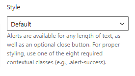
Style
The style options allows you to choose from a list of theme colours. By selecting a theme colour the alert block background, text and border colour will be updated to match the theme option. There are 8 options available:
- Primary: Selected as default
- Secondary
- Success
- Danger
- Warning
- Info
- Light
- Dark
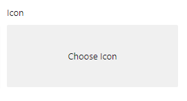
Icon
The icon option allows you to upload an image that will be displayed to the left of the alert block. To add an icon click the Choose icon button then upload or select an image.
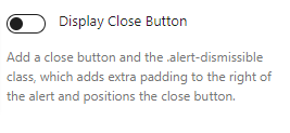
Display close button
The display close button option allows you to include a close button on the alert and when a user clicks the button the alert block will be removed from the page. As default the close button isn’t displayed, by checking this option the close button will be displayed.
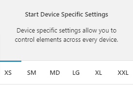
Device specific settings
Along with global options for a block there are also device specific settings. These settings allow you to specify options that will be applied to their relevant device size. The device sizes available match up with the Bootstrap breakpoints:
- XS (<576px)
- SM (≥576px)
- MD (≥768px)
- LG (≥992px)
- XL (≥1200px)
- XXL (≥1400px).
Device specific settings are tabbed and to update a specific device you simply need to click on the relevant tab to reveal the options. Each device has the same options available. For the purpose of these docs we only explain one device tab (as all of the other tabs are the same for their related breakpoint).
Highlighted Tabs
Due to there being options for a number of different device sizes it could become confusing remembering which settings you have chosen. To help, when you make a change in a specific device tab the tab will be highlighted green. If all of the values in the tab are reverted back to the default then the highlight will disappear.
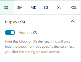
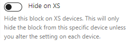
Hide on XS
You can hide this block on any device. As default all blocks are displayed. If you wish to hide a block on a specific device you can check this option. This option will only apply to the related device. To hide on other devices, click on the relevant device tab and check the Hide on [device] option.
Reset Settings
Blocks tend to have a large number of settings along with different settings for each device size. You may get to the point where you have changed lots of settings and want to revert them back to the default. This can be time consuming and difficult to remember which settings have been changed to we have supplied three buttons that make this a piece of cake. Simply click the relevant button to reset your settings.
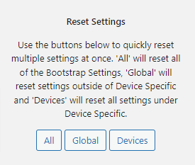
- All: When you click this button is will reset all of the settings for the selected block
- Global: When you click this button it will reset all of the settings outside of the device specific tabs
- Devices: When you click this button it will reset all of the settings within the Device Specific tabs
Advanced
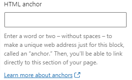
HTML Anchor
The HTML anchor option allows you to set an ID on the current block. This is useful when you wish to link to a specific area on a page.
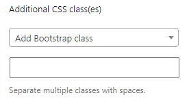
Additional CSS class(es)
The additional class(es) option lets you add any other classes to the block. This is really useful as it allows you to utilise all of the Bootstrap utility classes to quickly apply styles and add more advanced customisations. A few examples of this would be to align all inner content by adding the text-start, text-center or text-end classes. You also have the ability to quickly search all of the available Bootstrap classes. To search Bootstrap classes open the Add Bootstrap class select box. You can filter the results by typing in the available search field. When you select an option it will automatically be added to your class list.